 I decided to lookup different menu styles so I could see the possibilities out there for future menu designs. I found this menu design for a New York. This menu I think is pretty good because the fonts are simple enough to go with the design. The spacing isn't too bad between the type either but I do think some of the tracking could be reworked in the paragraphs.
Sunday, May 4, 2014
Menu styles
http://cowpen.ipower.com/Menu.htm
I decided to lookup different menu styles so I could see the possibilities out there for future menu designs. I found this menu design for a New York. This menu I think is pretty good because the fonts are simple enough to go with the design. The spacing isn't too bad between the type either but I do think some of the tracking could be reworked in the paragraphs.
I decided to lookup different menu styles so I could see the possibilities out there for future menu designs. I found this menu design for a New York. This menu I think is pretty good because the fonts are simple enough to go with the design. The spacing isn't too bad between the type either but I do think some of the tracking could be reworked in the paragraphs.
Friday, May 2, 2014
Menu Fonts
http://www.fontspace.com/category/menu

I looked up more fonts for the menu if there's anything else I can use. I want the title to have the right amount of focus I need to make the menu successful. This font called merienda bold might work if I made it the new font for little Tokyo. I have so far seen pretty worse fonts out there from researching with my blogs all semester. This font is not too bold but has enough strength I feel to add something more to my design.
I looked up more fonts for the menu if there's anything else I can use. I want the title to have the right amount of focus I need to make the menu successful. This font called merienda bold might work if I made it the new font for little Tokyo. I have so far seen pretty worse fonts out there from researching with my blogs all semester. This font is not too bold but has enough strength I feel to add something more to my design.
Thursday, May 1, 2014
Bad Menus again

http://fightbaddesign.wordpress.com/
I found another good example of a bad menu design online today. The font to me looks like papyrus believe it or not. There isn't too much font variation at all in the menu overall and I think the yellow color on the black background isn't a good idea. A black background isn't always a beneficial feature to a menu design. This menu was design for a grill in NY and I feel that the design is very out of date. This restaurant is apparently in brand new and I feel the design should have been much better, I know if I wanted someone to design my menu for my restaurant I sure wouldn't want this. This could have easily been replicated on Microsoft word.
Wednesday, April 30, 2014
Menu stuff
http://www.ofifacil.com/en-ideas-examples-restaurant-menu-design-menu-layout.php
All of my type is officially on the menu for little Tokyo as of today but I feel there are some levels of hierarchy to still consider. Is my entrees selection in the best spot and have I focused on sushi enough because it the main deal for the restaurant. I found a font I liked called "manga" today in class and I think this font could help my front cover, I know its still early into he project so I can still make changes if I need to. I found this menu to below to be quite interesting. I like the style of the sandwich but I feel the hierarchy in this menu is a little whack. The layout is messing and hard to follow because its all over the place, it becomes hard to read eventually as you work your way reading it. I don't want my menu to confuse anyone when its being read. I feel with a better font and some variation this menu could be much better, this is a perfect example of why order can be important in graphic design.

All of my type is officially on the menu for little Tokyo as of today but I feel there are some levels of hierarchy to still consider. Is my entrees selection in the best spot and have I focused on sushi enough because it the main deal for the restaurant. I found a font I liked called "manga" today in class and I think this font could help my front cover, I know its still early into he project so I can still make changes if I need to. I found this menu to below to be quite interesting. I like the style of the sandwich but I feel the hierarchy in this menu is a little whack. The layout is messing and hard to follow because its all over the place, it becomes hard to read eventually as you work your way reading it. I don't want my menu to confuse anyone when its being read. I feel with a better font and some variation this menu could be much better, this is a perfect example of why order can be important in graphic design.
Tuesday, April 29, 2014
Tara Arms Menu
http://taraarms.com/wp-content/uploads/2012/02/NEW-2012-MENU-front.jpg

I found another menu to look at and I found something's about this menu that bothered me and its it fonts. I feel there isn't enough font variation in this menu and I feel the font choices are too similar looking. The spacing and tacking looks decent in the menu at first but I feel the arrangement of the items could use some work. Each of the items do have a description and its explained clearly. I know the arrangement of the items are very important in creating my menu, because I have a lot of sushi and entrée items. I need to make sure I have the right amount of hierarchy in this project.
I found another menu to look at and I found something's about this menu that bothered me and its it fonts. I feel there isn't enough font variation in this menu and I feel the font choices are too similar looking. The spacing and tacking looks decent in the menu at first but I feel the arrangement of the items could use some work. Each of the items do have a description and its explained clearly. I know the arrangement of the items are very important in creating my menu, because I have a lot of sushi and entrée items. I need to make sure I have the right amount of hierarchy in this project.
Monday, April 28, 2014
Font Ideas
http://www.dafont.com/born-wild.font
http://www.dafont.com/painted-lady.font

Menu Fonts
http://www.documentsanddesigns.com/reception_accessories/reception_accessories_Vivaldi.htm
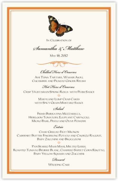 After class today, I have decided to look up more menu's for options to expand on for my menu design. I already know what thumbnail I am recreating for my design. The text sizing is also something I want to focus on carefully because I don't want the font to be too small or too big. I found a font site that will help me find out what to watch for when creating my menu for Little Tokyo. I find this formal menu for a wedding to look at. The spacing is accurate and the tracking seems correct. The font is centered and that tells me that this card is very formal. I need to decide if my menu is going to have centered text or not. I like the script font but I think it might not be just the right type of font style I would choose.
Subscribe to:
Posts (Atom)