http://www.documentsanddesigns.com/reception_accessories/reception_accessories_Vivaldi.htm
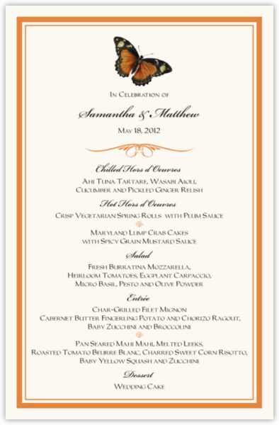
 After class today, I have decided to look up more menu's for options to expand on for my menu design. I already know what thumbnail I am recreating for my design. The text sizing is also something I want to focus on carefully because I don't want the font to be too small or too big. I found a font site that will help me find out what to watch for when creating my menu for Little Tokyo. I find this formal menu for a wedding to look at. The spacing is accurate and the tracking seems correct. The font is centered and that tells me that this card is very formal. I need to decide if my menu is going to have centered text or not. I like the script font but I think it might not be just the right type of font style I would choose.
No comments:
Post a Comment