http://www.artguycreative.com/restaurant-menu-design.html
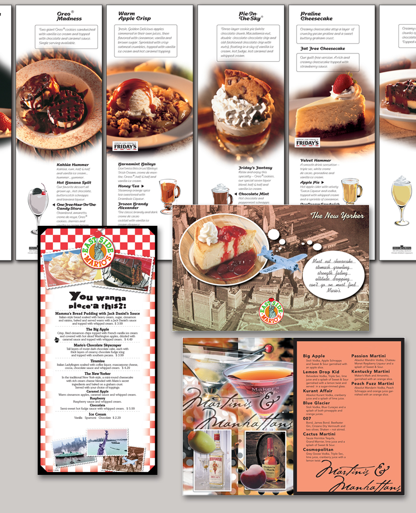
I found another menu today, this one is okay but I know it can use more improvements. The pictures directly in the center are a little too much. I feel if the pictures were smaller and off to the side of the menu it wouldn't be as distracting on the menu. It is all about food, but you want to have a design that works well with the flow of the menu. The pictures don't go too well with the text boxes because it creates too much movement and tension within the reading of the menu. You want to create a menu that is good to read. The pictures are good but don't make the menu better because it weighs the piece down too much.
No comments:
Post a Comment