Monday, March 31, 2014

Spacing on The Label

     http://waterbottlelabelsguide.com/finding-the-right-size-of-water-bottle-labels/


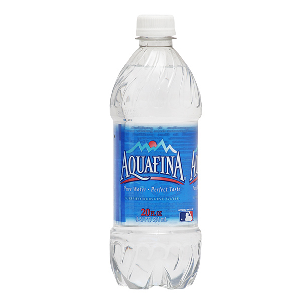
                      Today in class, we talked about the spacing and how important where text is placed on our labels. I know that when I test print I want to have my label's text in the right levels of hierarchy. I decided to look up more examples of do's and don'ts for my label design. I know the colors have to be the right colors otherwise they will clash, right now I have shades of blues. I know putting white text on a yellow background is a obvious no in any design, because that is a no brainer. One tip I found helpful is the website's tips on finding the right water bottle label size. This website was able to answer a lot questions I had when I started thumbnails for this project 3. I also got great tips on designing water bottle labels for a company in general. Your want to have the right amount of branding for your company whenever you are designing something for the company. 

Things I know I have to watch out for ....
1. Spacing is crucial
2. The Fonts
3. color scheme
4. sizing
5. clarity

Sunday, March 30, 2014

Uniquely Shaped


http://creativeaboutdesign.wordpress.com/2010/08/03/clever-space-saving-water-bottle-lh2o/


I found these strangely shaped water bottles amusing to look at. Its geometric but clever and I like it because its one of those things I would buy because I am in love with the design. The  Label design on this is pretty simple but I like the H20 concept and how they used the molecular formula to build their design shape. Science was involved into the idea. The size and shape of these are interesting because I have seen little water bottles before but this concept takes it to another scale. The name of this bottle is called LH20 and was designed by a company called Agua De Luso. The design is meant to be easy to hold and store.

Saturday, March 29, 2014

Water Bottle Info

    
http://www.blushprintables.com/waterbottles-detailed.html


                So far I noticed there are other things that go on a water bottle besides just the name brand and the logo. The bottle has also nutrition facts as well on the label and the recycling symbol. I have looked Poland spring, deer park, and even store brand labels to get more ideas. Take these custom made labels for example they have the nutrition facts on them in different ways to help me brainstorm more ideas.  The more examples I find before I finish project 3 the better. I want to have a firm grasp on this project especially in what I need to make my design successful. I know having all the parts and the correct sizing for my design will be important to have a well design.

Thursday, March 27, 2014

Water Bottle Styles

     http://www.bottleyourbrand.com/    

    http://youtu.be/RJK1AEs9ZFM         


Diamond Ring

          Water bottle sizes and shapes vary by the company and their brand. Some companies I have looked up have even bigger bottle dimensions so their actual label sizes are bigger and are different than basic water bottle labels at 8x2 in. I found this great website to help me get more ideas on my brand of Natural Spring Water.  I found some benefits of Vinyl water bottle labels if I was actually making labels for a company.  I found a water bottle label I found that was cute for an upcoming wedding, its a nice design for a water bottle label.

Vinyl
  • Waterproof and extremely durable
  • Easy to peel & stick anywhere
  • Matte coated finis
  • Scratch-resistant
  • Permanent adhesive
  • Photo-quality printing
 

Monday, March 24, 2014

The Fiji Water Company

   http://www.fijiwater.com/


File:Artesian Well.png
I looked up  the water bottle company, Fiji Water to examine their design.  Their philosophy is their water company is the finest water, artesian water from the earth. Their whole process in making the water is done by an artesian well method. I decided to lookup what this method is. The mean demographic of this company is mostly targeted at the rich I believe, because it seems like its fancy water. Most of the celebrities on the website support the company and this company actually offers door to door delivery of their product. They actually have  several subscription plans for their door delivery for anyone to choose. The water bottle design overall, is very elegant with a illusion background of the water bottle. The font and typographical elements of the design  stand well together, because it goes well with the overall theme of the company.


Product display tree

Sunday, March 23, 2014

Stuff On A Water Bottle Label


Plantbottle
http://www.dasani.com/#drops


Today I looked up the Dasani Water Company and looked at their designed water bottle. This water is purified water with enhanced materials.  One thing I know about their brand from researching their website, is their bottles are made from recycled plastic and are used to make other recycled products. I didn't know that 30% of the material is made from a plant resource to make this bottle 100% recyclable. I like that this bottle is design for the present use and future use. One thing I want to consider for my label design is what audience am I targeting? This feature on this bottle actually targets young and old with recycling and I think that's clever. The font of the word "Dasani" goes well with the overall design, when I think of water bottle design I'll remember the ideas from this company.
Flavors

Saturday, March 22, 2014

Unique Water Bottles

               
         http://www.zazzle.com/water+bottle+labels
http://www.zazzle.com/heart_love_knot_western_water_bottle_label-106946763072000546

               Today I decided to look up unique water bottles and brainstorm more ideas for my design for project 3. There are a lot of websites out there who will customize your labels for special events such as weddings or baby showers. Places like zazzle.com will actually customize and create your label ideas for you. You just pick the font, design, and pretty much can put whatever you want on the label to personalize it. This site was easy to use and I was able to navigate through the site to get more ideas. I found the labels to be pretty simple and only if it was for party purposes. These labels wouldn't  be used for retail purposes and most of these are decorative water bottle labels.

Thursday, March 20, 2014

Aquafina Water Bottles


http://www.aquafina.com/


   I noticed the Aquafina's bottle label size to be a little bigger than then average water bottle label size. I took a look directly onto Aquafina's website, to lookup more about their style of branding their water bottles. How they directly design their label is what interests me. I like how it has a translucent appearance but still is fully designed on the bottle. The bottle looks see through but its not, an optical illusion I think would be cool for my design  since I want to target a younger audience of adults. The font is rather simple but legible on the bottle, its mean to be read close up. I color choices on the bottle aren't a lot either and I think less on the design works better for this bottle label. Sometimes in design less can mean so much more in how well the product or packaging is designed.  

Wednesday, March 19, 2014

Water Bottle Label Sizes

                     
8" x 2" Labels

http://www.onlinelabels.com/ol1159.htm
  I decided to look up the sizing in water bottle label to know what sizing I need for my project. I know that label needs to wrap around the bottle and have be the right size. If the label is too big it won't fit the bottle right. The standard size is 8 inches by 2 inches in size or 8.5 inches by 2 inches. I know I want to make my water bottle design around these sizes. I found this website helpful with templates and sizing because I wasn't sure of what size to use.

Monday, March 17, 2014

Water Bottle Labels

     http://www.myownlabels.com/bottled-water-labels/

http://www.myownlabels.com/bottled-water-labels/SPFY19/

beer labels #evermine

   We already received out specs for project 3 and we are designing a water bottle. I decided to look up labels and what they actually look like. I need to find out what I need to put on my label besides a barcode and name brand. To my surprise there are website, like myownlabels.com that  people  can use to make your own custom water bottle labels out there. On this website you can design your labels and make your own custom labels to order. On this site you could make coasters, bottle labels, food labels, and even photo labels.

food/craft labels #evermine

Sunday, March 16, 2014

Fonts


http://www.fonts.com/


        I looked up more fonts to see if there are anymore options out there for fonts. I found one called Metro Nova which I thought looked really good in color as a design. I'm sure if this
type of font would help my cover or not. Its not too extreme or too weak, I feel the font is right in between. I also worry that it could hurt the cover design. Another font I found unique is called  All Of Me, and its like a rubber stamp print. I think this would look appealing in the color  white on my black book cover. I know that this font is definitely a step up from that chalkboard looking font that looks absolutely terrible with anything.

Friday, March 14, 2014

Another Possible Font

      http://www.designyourway.net/blog/resources/70-new-and-interesting-fonts-for-your-design-projects/
http://www.behance.net/gallery/FF-Basic-Gothic/872609


   I found another font that could also work for my cover, its called FF Basic Gothic and it looks like an Arial font. This font could work for my design because its not too bold to overpower the design on my cover or too thin of a font.
I try this font and see if it works on my cover if not I'll keep searching. This font also doesn't look too aged because I know some fonts on the Mac so far have been too weak. One common mistake people make is sticking with the fonts only on the mac instead of downloading newer fonts.  I discovered there are so many fonts out there to use and download. This is one way I can use font variation into my project and give it more strength. I know after seeing good and bad covers the typography can make or break the piece.

More Fonts To Consider in Typography

    http://www.behance.net/gallery/Movavi-Grotesque-Black/971697

  http://www.designyourway.net/blog/resources/70-new-and-interesting-fonts-for-your-design-projects/    

Download Movavi Grotesque Black free font
I decided to lookup more fonts choices Online maybe I could end up finding one and download it for my book cover. The only major issue I am still having is font variation in my project.  The variation in font is important when giving weight to your piece. Without font variation you are missing something essential to your project.  This font here I found was neat and its called  Movavi and its bold but its readable. I think a font like this could work for my design because its not too serious but still strong enough to help my design and not hurt it.  I am going to see if I can download this font and use it on my cover to see if it helps.              

Wednesday, March 12, 2014

Good Fonts

http://www.thebookdesigner.com/2011/08/5-great-fonts-for-book-covers/

             Right now I'm stilling struggling to find the right font, as I am finishing my design. I decided to research good type so I wouldn't fall into a trap with bad typography. The cover's type is crucial to the whole design because weak type will bring my cover down. I have worked too hard on this cover to have a crappy font choice. This font is called League Gothic, and I have seen this font used on Stephen King's or James Paterson's book covers before. I found this website the most helpful today because throughout class I changed the font choices so many times. I know finding the right font is very difficult after today in class.


great fonts for book coversgreat fonts for book covers

Checklist For My Cover


http://media-cache-ec0.pinimg.com/originals/7b/5e/c2/7b5ec2478a0ad470aca5321a4029d703.jpg

   
    I know that my cover needs to be made only out of typography, and right now I am trying the use the words New Rose Hotel, one of the short stories. I am taking the typography and repeating the type over and over again to form the shape of the rose in type. So far its been a challenge because I can only use type as the artform and that has turned out to be quite difficult.  I decided to go onto to pinterest and lookup all sorts of book covers to help me more.  I found another example that might help me today as I work on my project. This cover for example, has beautiful typography. The artist,  took the type to create their own font and that is something I hope to do later during the semester. I know making a book cover like this would take a great deal of time to create it. I found another cover on Pintrest, The Secret Garden, which uses is own typography.

Tuesday, March 11, 2014

Another Good Design

http://www.faceoutbooks.com/13011

http://www.jennygrigg.com/

     I found another good cover just now to help me this week while I'm working on my project. I found this cover very good with only its typography not even its color scheme or overall theme. My mission today is to look for well typography. The artist who designed for Peter Carey actually stuck with a similar form and font. No matter what the color is the background, the type still stands independently on its own.  It does what it was designed to do as a strong font. The artist's name is Jenny Grigg and I found her website as well to look up more designs by her. She creates a lot of good book  covers, there well thought out and I'm glad to her found her site for future inspiration. ;)

Well Designed "Me Before You" Cover

http://www.huffingtonpost.com/2013/06/27/best-book-covers-2012-_n_3509364.html#slide=2627337

                  I wanted to find a cover in just typography today to critique because I wanted a good example of the use of typography into my design. I have mostly been researching on designs that are good and bad. This cover uses the typography to shape the design of the cover and that is what we are specifically doing in project 2 for my book cover. This cover, Me Before You, was designed by Michael Joseph, and uses strong typography. I remember how we talked about in class how even the small type can be important on the cover as well. The author could have used more font variation but the piece has enough of weight to it and that's what makes this design work well.  The type  can support the cover with only a limited color palette and one font choice. This I feel is perfect example of how our book  covers can be simple but still be effective in design by the power of typography.    

Wiliam Gibson

          http://www.williamgibsonbooks.com/books/books.asp


            I decided to look up more about William Gibson because I wanted to know more about the author after reading my short story for project 2. He has written several books, including Burning Chrome, which is a collection of short stories that we are using for project 2. In his latest book of essays and articles, Distrust That Particular Flavor, its about the whole writing culture told in William Gibson's world. I noticed the author creates his world and characters by giving them all an interesting plot, but  the plot are realistic.  Another book he has written is called is Zero History is about dangerous and futuristic world. His type of genre is science fiction I have discovered throughout most of his pieces of literature follow the same pattern. In Pattern Recognition, it is about a marker researcher consultant who's computer gets hacked and leads her to more information about her corrupted world.


Monday, March 10, 2014

More Bad Book Covers

http://pelfind.com/photo/28577p596605/35-typographic-book-covers-judging-a-book-by-its-cover
                    I decided to continue looking for  more bad book covers for examples on specifically  what not to do. I learn the best from examples and I feel this research has been very helpful. (I want my book cover to be the most successful for this project.) Some people out there do judge a book by its cover. I decided to look for  books with bad typography and got shocking results.  Below is the most confusing one for me because of the lack of readability. I chose this  cover out of many poor designs because it's bad  readability  made it stand out as the  worse. Sure the words look neat on the cover but I can't simply read it. My eyes are struggling to read the type. One of the most important things when making a book  cover is to  make  sure the cover  is readable especially if the cover is  all typography. This cover is only typography, you want the cover to be readable period. 


Book Cover Don'ts

 http://flavorwire.com/378513/20-embarrassingly-bad-book-covers-for-classic-novels/5/


dubliners             I also have decided to research bad book covers so I know exactly what to avoid when creating my book  cover for burning chrome. Some covers I saw didn't have the right amount of hierarchy in their designs. With little font variation the cover becomes boring and has no interest to the audience. The worst cover I found so far was Dubliners because the color and especially the typography shows how much the cover is really outdated. There is nothing that this cover has on it that makes it appealing at all.


Another flop I found was a recreation of the Dorothy and the  Wizard of Oz. This cover has no emerald city but a space scene likes its something out Star Wars. This cover is not only misleading but disappointing to any fans of the Wizard of Oz series. One thing that also bothers me is the type and the spacing because the font could have been so much bigger. I have attached the website for giggles of more dreadful book  covers. Enjoy! 

Typography On A Bigger Scale

 http://www.signage-solutions.com/ss-site/home.html

                  I decided to research more on the other forms of typography that are used today out there in the design world.  There is more ways typography can be manipulated and I am discovering this more as I research. The main points we see on a book cover display Typography  is readability and  legibility all the time with the font choice you decide on. Negative space can work on a cover if you allow it to. I found a great website on signage solutions to use as a resource for design ideas id I was ever designing a billboard, a poster or a flyer. I need to have a well established level of hierarchy for my book  cover. I need to check  the sizing of my fonts,  the position, and also the weight and variation of my piece. I now know small type can still be considered important into a design such as  designing a restaurant menu. Other types of display typography out there is posters, magazine ads, wraps, websites, web ads, and even airplane banners.

Thursday, March 6, 2014

My Book Cover So Far


http://jessperna.com/images/covers/rose_book_cover.JPG


             I have found some images I can use to help me replicate a rose I want to do for my cover. I'm going to make a long stem rose and somehow incorporate "New Rose Hotel" into the rose in typography. I research other covers to help me see the effect I want to use into my design for my cover. Below is a picture of what I want to do. I have my template set up already and I am continuing to work on it.

Wednesday, March 5, 2014

Book Ideas

        http://bookcoverarchive.com/


     I found more book covers that brainstormed more ideas for me this morning. I really want to have the typography to standout in my piece and make it create enough of a visual to entertain the audience. A good cover will make the book even more appealing to a younger generation and that is the look I am going for.  I found this book cover archive that provided me with enough information on even better book covers.  Some great designers I found were Barbara Dewilde, Isaac Tobin, and Jason Booher. These designers used the power of typography to enhance their design.

Tuesday, March 4, 2014

Book Cover research

         http://www.aliciadunams.com/nine-things-that-need-to-be-on-your-book-cover/


              The book that I am recreating must have a barcode and other elements on the cover that are essential. What if I wanted to make my own book cover? What would I need to have? The book cover needs to make the right first impression to its audience by the right amount of branding. The cover can also have a short biography about the author of the book. It's good to let the readers know more about the author and maybe give the readers a hint about what the book is about. Your name should also be on the book  because that's an important part of branding when making a book cover.  You may also want to include a website address to attract more interest towards the book, that way readers can find out  more information. Once again, I found out branding is very essential to making a book cover.

Sunday, March 2, 2014

More Book Cover Ideas

Nathaniel Rich, “The Mayor’s Tongue”          http://blog.ardes.com/2008/12/2/best-book-cover-design-2008

http://nytimesbooks.blogspot.com/2008/11/my-favorites-of-2008.html


         I decided to find more book cover ideas to help me finalize my design ideas from my sketches. I actually found some more interesting covers from other blog. This book cover has a great use of typography with the font moving across the page zigzag and diagonally. The use of  black and red in the cover are enough of a color scheme because the typography is so strong. Some other covers below I found are sort of what I want to do for my book cover. The typography in neon lights would make a cool cover for "New Rose Hotel". I want to also have a great color scheme on my cover to highlight the typography.