Wednesday, April 30, 2014

Menu stuff

                  http://www.ofifacil.com/en-ideas-examples-restaurant-menu-design-menu-layout.php       


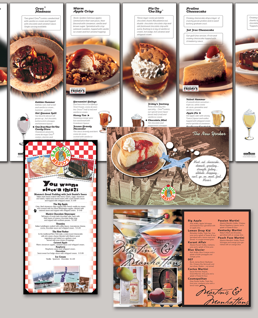
            All of my type is officially on the menu for little Tokyo as of today but I feel there are some levels of hierarchy to still consider. Is my entrees selection in  the best spot and have I focused on sushi enough because it the main deal for the restaurant. I found a font I liked called "manga" today in class and I think this font could help my front cover, I know its still early into  he project so I can still make changes if I need to. I found this menu to below to be quite interesting. I like the style of the sandwich but I feel the hierarchy in this menu is a little whack. The layout is messing and hard to follow because its all over the place, it becomes hard to read eventually as you work your way reading it. I don't want my menu to confuse anyone when its being read. I feel with a better font and some variation this menu  could be much better, this is a perfect example of why order can be important in graphic design.


Tuesday, April 29, 2014

Tara Arms Menu

http://taraarms.com/wp-content/uploads/2012/02/NEW-2012-MENU-front.jpg


                  I found another menu to look at and I found something's about this menu that bothered me and its it fonts. I feel there isn't enough font variation in this menu and I feel the font choices are too similar looking. The spacing and tacking looks decent in the menu at first but I feel the arrangement of the items could use some work.  Each of the items do have a description and its explained clearly. I know the arrangement of the items are very important in creating my menu, because I have a lot of sushi and entrĂ©e items. I need to make sure I have the right amount of hierarchy in this project.

Monday, April 28, 2014

Font Ideas

                           
http://www.dafont.com/born-wild.font
http://www.dafont.com/painted-lady.font


          I decided to look up more fonts options for Little Tokyo. I want to have a good font choice for my menu, especially the front cover. One font I found is called born wild that I found dafonts.com that I could download and use for my menu cover. Another font that I found that could also work is called  Painted Lady, and is has a nice stroke to it like calligraphy. The restaurant is called Little Tokyo and I want the font to speak for itself and represent the restaurant in the right way. I feel that one of these fonts could help my menu well.  

Menu Fonts

              
http://www.documentsanddesigns.com/reception_accessories/reception_accessories_Vivaldi.htm


Butterfly Wishes              After class today, I have decided to look up more menu's for options to expand on for my menu design. I already know what thumbnail I am recreating for my design. The text sizing is also something I want to focus on carefully because I don't want the font to be too small or too big. I found a font site that will help me find out what to watch for when creating my menu for Little Tokyo. I find this formal menu for a wedding to look at. The spacing is accurate and the  tracking seems correct. The font is centered and that tells me that this card is very formal.  I need to decide if my menu is going to have centered text or not. I like the script font but I think it might not be just the right type of font style I would choose.

Friday, April 25, 2014

Another Menu example

http://baddaddysburgerbar.com/Downloads/BD_MainMenu.pdf


Stacks Image 219


I found another menu design, called Bad Daddy's Burger Bar. I like the fonts used in this menu first off, the main things on the menu are bolded for importance. The side dishes are mentioned but don't have as mush importance as the main meal to choose from The color palette something I noticed to watch for, I know from class discussions that orange and black are flat out Halloween colors. By looking at the menu I know that the place has burgers because its the only major thing on the menu. The menu is easy to read and its represents  the restaurant I feel in a good way. Overall, I think this menu is a good example to keep in mind when I'm designing my menu.  

Another Menu


http://www.artguycreative.com/restaurant-menu-design.html

 I found another menu today, this one is okay but I know it can use more improvements. The pictures directly in the center are a little too much. I feel if the pictures were smaller and off to the side of the menu it wouldn't be as distracting on the menu.  It is all about food, but you want to have a design that works well with the flow of the menu. The pictures don't go too well with the text boxes because it creates too much movement and tension within the reading of the menu.  You want to create a menu that is good to read. The pictures are good but don't make the menu better because it weighs the piece down too much.

Monday, April 21, 2014

Bad Menu

    http://www.badpandagraphics.co.uk/images/portfolio/menus/l/WOTM-MENU.jpg


           I found a menu design that I once again found problems with to help me improve my design this week, this one is really bad. First, the type is horrible and there is very little variation, I can't tell if two different fonts were even used. Second, the text is group so closely together it becomes hard to even read and understand. You want to have a menu that is clear to read, period otherwise it just creates more confusion. Some of the items have a description and some don't, I know that this is bad thing to have on the menu if the layout isn't the same throughout the piece. You can have it both ways sometimes into a design but its got to have clarity into the design. Otherwise, if you don't pay attention to what the type is doing you have this mess. This menu is just plain bad typography all around its weighing it down severely.   

Menus

          http://www.menutemplates.org/menu-templates/ice-cream-menu.html

Ice-Cream-Menu

           So we learned today that project 4 is making a menu all out of type. I already have seen some menus today during my research in class, but I figured I find a good example tonight to focus on. I feel that menu's look easy to make but have discovered its all about the typography. And if your spacing is whack and out of place it can ruin the whole form of the menu. I found this ice cream menu template to critique. The color scheme and graphics work well together, however I feel the font on the menu is too childish. The fonts clash too much and don't work well together. When designing something its great to have font variation but the different fonts need to work well together. The type is legible but it needs work for sure if it wants to be a better menu. Any restaurant could easily find another designer to make them a better menu, as a designer you need to know what looks best and apply it to your design.

Saturday, April 12, 2014

Fonts


http://www.fonts.com/font/the-foundry/foundry-sans
             I decided to look up more good fonts choices that I could use for future project. I found this sans font that I think would have worked well for my bottle label project. Its not too serious or not simple that its weak for a font choice. I feel this font would be good for many project that require some text.


Good Uses Of Typography

                      
http://naldzgraphics.net/freebies/40-best-fonts-for-better-typography-designs/


     I decided to look up some good uses in typography to get more strong ideas for project four. The only thing I know for project four that it will be multiple pages in length. I looked up good fonts for future use. Project 3 I felt this time was successful and I finally had the right type on my water bottle label. I know there are things I need to check but I can fix them.


vintage

Friday, April 4, 2014

Water Bottles

http://www.bottleyourbrand.com/water-bottle-labels

http://www.bottleyourbrand.com/custom-beer-label


Make Your Own Beer Labels           I found another website that will help me in the future if I needed to make water bottle labels. I know what needs to go on them and I have made sure that I have all the type and information I needed on the bottle for Wednesday. I have looked up custom bottle labels some more and saw more ideas that could help me improve my design even more. I decided to just look up labels in general because there are more possibilities besides just water bottle design.
There are beer labels, wine labels, soda bottles labels, and even food label out there to use for more brainstorming ideas. The thing about label design out there is there are more ideas out there than I thought of.