http://www.aquafina.com/
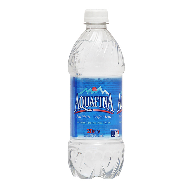
I noticed the Aquafina's bottle label size to be a little bigger than then average water bottle label size. I took a look directly onto Aquafina's website, to lookup more about their style of branding their water bottles. How they directly design their label is what interests me. I like how it has a translucent appearance but still is fully designed on the bottle. The bottle looks see through but its not, an optical illusion I think would be cool for my design since I want to target a younger audience of adults. The font is rather simple but legible on the bottle, its mean to be read close up. I color choices on the bottle aren't a lot either and I think less on the design works better for this bottle label. Sometimes in design less can mean so much more in how well the product or packaging is designed.
No comments:
Post a Comment