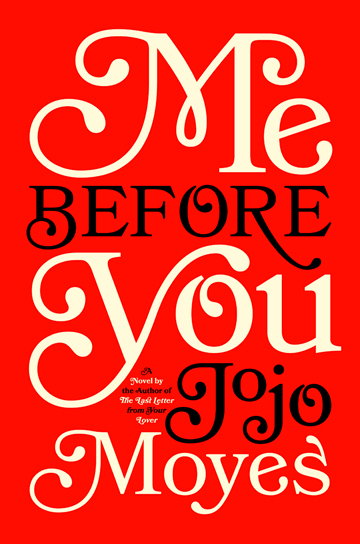
 I wanted to find a cover in just typography today to critique because I wanted a good example of the use of typography into my design. I have mostly been researching on designs that are good and bad. This cover uses the typography to shape the design of the cover and that is what we are specifically doing in project 2 for my book cover. This cover, Me Before You, was designed by Michael Joseph, and uses strong typography. I remember how we talked about in class how even the small type can be important on the cover as well. The author could have used more font variation but the piece has enough of weight to it and that's what makes this design work well. The type can support the cover with only a limited color palette and one font choice. This I feel is perfect example of how our book covers can be simple but still be effective in design by the power of typography.
Tuesday, March 11, 2014
Well Designed "Me Before You" Cover
http://www.huffingtonpost.com/2013/06/27/best-book-covers-2012-_n_3509364.html#slide=2627337
I wanted to find a cover in just typography today to critique because I wanted a good example of the use of typography into my design. I have mostly been researching on designs that are good and bad. This cover uses the typography to shape the design of the cover and that is what we are specifically doing in project 2 for my book cover. This cover, Me Before You, was designed by Michael Joseph, and uses strong typography. I remember how we talked about in class how even the small type can be important on the cover as well. The author could have used more font variation but the piece has enough of weight to it and that's what makes this design work well. The type can support the cover with only a limited color palette and one font choice. This I feel is perfect example of how our book covers can be simple but still be effective in design by the power of typography.
I wanted to find a cover in just typography today to critique because I wanted a good example of the use of typography into my design. I have mostly been researching on designs that are good and bad. This cover uses the typography to shape the design of the cover and that is what we are specifically doing in project 2 for my book cover. This cover, Me Before You, was designed by Michael Joseph, and uses strong typography. I remember how we talked about in class how even the small type can be important on the cover as well. The author could have used more font variation but the piece has enough of weight to it and that's what makes this design work well. The type can support the cover with only a limited color palette and one font choice. This I feel is perfect example of how our book covers can be simple but still be effective in design by the power of typography.
Subscribe to:
Post Comments (Atom)
No comments:
Post a Comment