http://www.designyourway.net/blog/resources/70-new-and-interesting-fonts-for-your-design-projects/
http://www.behance.net/gallery/FF-Basic-Gothic/872609
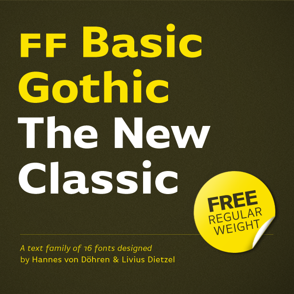
I found another font that could also work for my cover, its called FF Basic Gothic and it looks like an Arial font. This font could work for my design because its not too bold to overpower the design on my cover or too thin of a font.
I try this font and see if it works on my cover if not I'll keep searching. This font also doesn't look too aged because I know some fonts on the Mac so far have been too weak. One common mistake people make is sticking with the fonts only on the mac instead of downloading newer fonts. I discovered there are so many fonts out there to use and download. This is one way I can use font variation into my project and give it more strength. I know after seeing good and bad covers the typography can make or break the piece.

No comments:
Post a Comment