 I decided to lookup different menu styles so I could see the possibilities out there for future menu designs. I found this menu design for a New York. This menu I think is pretty good because the fonts are simple enough to go with the design. The spacing isn't too bad between the type either but I do think some of the tracking could be reworked in the paragraphs.
Sunday, May 4, 2014
Menu styles
http://cowpen.ipower.com/Menu.htm
I decided to lookup different menu styles so I could see the possibilities out there for future menu designs. I found this menu design for a New York. This menu I think is pretty good because the fonts are simple enough to go with the design. The spacing isn't too bad between the type either but I do think some of the tracking could be reworked in the paragraphs.
I decided to lookup different menu styles so I could see the possibilities out there for future menu designs. I found this menu design for a New York. This menu I think is pretty good because the fonts are simple enough to go with the design. The spacing isn't too bad between the type either but I do think some of the tracking could be reworked in the paragraphs.

Friday, May 2, 2014
Menu Fonts
http://www.fontspace.com/category/menu

I looked up more fonts for the menu if there's anything else I can use. I want the title to have the right amount of focus I need to make the menu successful. This font called merienda bold might work if I made it the new font for little Tokyo. I have so far seen pretty worse fonts out there from researching with my blogs all semester. This font is not too bold but has enough strength I feel to add something more to my design.
I looked up more fonts for the menu if there's anything else I can use. I want the title to have the right amount of focus I need to make the menu successful. This font called merienda bold might work if I made it the new font for little Tokyo. I have so far seen pretty worse fonts out there from researching with my blogs all semester. This font is not too bold but has enough strength I feel to add something more to my design.
Thursday, May 1, 2014
Bad Menus again

http://fightbaddesign.wordpress.com/
I found another good example of a bad menu design online today. The font to me looks like papyrus believe it or not. There isn't too much font variation at all in the menu overall and I think the yellow color on the black background isn't a good idea. A black background isn't always a beneficial feature to a menu design. This menu was design for a grill in NY and I feel that the design is very out of date. This restaurant is apparently in brand new and I feel the design should have been much better, I know if I wanted someone to design my menu for my restaurant I sure wouldn't want this. This could have easily been replicated on Microsoft word.
Wednesday, April 30, 2014
Menu stuff
http://www.ofifacil.com/en-ideas-examples-restaurant-menu-design-menu-layout.php
All of my type is officially on the menu for little Tokyo as of today but I feel there are some levels of hierarchy to still consider. Is my entrees selection in the best spot and have I focused on sushi enough because it the main deal for the restaurant. I found a font I liked called "manga" today in class and I think this font could help my front cover, I know its still early into he project so I can still make changes if I need to. I found this menu to below to be quite interesting. I like the style of the sandwich but I feel the hierarchy in this menu is a little whack. The layout is messing and hard to follow because its all over the place, it becomes hard to read eventually as you work your way reading it. I don't want my menu to confuse anyone when its being read. I feel with a better font and some variation this menu could be much better, this is a perfect example of why order can be important in graphic design.

All of my type is officially on the menu for little Tokyo as of today but I feel there are some levels of hierarchy to still consider. Is my entrees selection in the best spot and have I focused on sushi enough because it the main deal for the restaurant. I found a font I liked called "manga" today in class and I think this font could help my front cover, I know its still early into he project so I can still make changes if I need to. I found this menu to below to be quite interesting. I like the style of the sandwich but I feel the hierarchy in this menu is a little whack. The layout is messing and hard to follow because its all over the place, it becomes hard to read eventually as you work your way reading it. I don't want my menu to confuse anyone when its being read. I feel with a better font and some variation this menu could be much better, this is a perfect example of why order can be important in graphic design.
Tuesday, April 29, 2014
Tara Arms Menu
http://taraarms.com/wp-content/uploads/2012/02/NEW-2012-MENU-front.jpg

I found another menu to look at and I found something's about this menu that bothered me and its it fonts. I feel there isn't enough font variation in this menu and I feel the font choices are too similar looking. The spacing and tacking looks decent in the menu at first but I feel the arrangement of the items could use some work. Each of the items do have a description and its explained clearly. I know the arrangement of the items are very important in creating my menu, because I have a lot of sushi and entrée items. I need to make sure I have the right amount of hierarchy in this project.
I found another menu to look at and I found something's about this menu that bothered me and its it fonts. I feel there isn't enough font variation in this menu and I feel the font choices are too similar looking. The spacing and tacking looks decent in the menu at first but I feel the arrangement of the items could use some work. Each of the items do have a description and its explained clearly. I know the arrangement of the items are very important in creating my menu, because I have a lot of sushi and entrée items. I need to make sure I have the right amount of hierarchy in this project.
Monday, April 28, 2014
Font Ideas
http://www.dafont.com/born-wild.font
http://www.dafont.com/painted-lady.font

Menu Fonts
http://www.documentsanddesigns.com/reception_accessories/reception_accessories_Vivaldi.htm
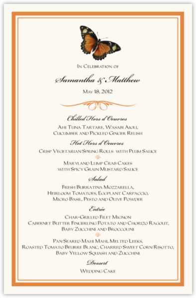 After class today, I have decided to look up more menu's for options to expand on for my menu design. I already know what thumbnail I am recreating for my design. The text sizing is also something I want to focus on carefully because I don't want the font to be too small or too big. I found a font site that will help me find out what to watch for when creating my menu for Little Tokyo. I find this formal menu for a wedding to look at. The spacing is accurate and the tracking seems correct. The font is centered and that tells me that this card is very formal. I need to decide if my menu is going to have centered text or not. I like the script font but I think it might not be just the right type of font style I would choose.
Friday, April 25, 2014
Another Menu example
http://baddaddysburgerbar.com/Downloads/BD_MainMenu.pdf

I found another menu design, called Bad Daddy's Burger Bar. I like the fonts used in this menu first off, the main things on the menu are bolded for importance. The side dishes are mentioned but don't have as mush importance as the main meal to choose from The color palette something I noticed to watch for, I know from class discussions that orange and black are flat out Halloween colors. By looking at the menu I know that the place has burgers because its the only major thing on the menu. The menu is easy to read and its represents the restaurant I feel in a good way. Overall, I think this menu is a good example to keep in mind when I'm designing my menu.
I found another menu design, called Bad Daddy's Burger Bar. I like the fonts used in this menu first off, the main things on the menu are bolded for importance. The side dishes are mentioned but don't have as mush importance as the main meal to choose from The color palette something I noticed to watch for, I know from class discussions that orange and black are flat out Halloween colors. By looking at the menu I know that the place has burgers because its the only major thing on the menu. The menu is easy to read and its represents the restaurant I feel in a good way. Overall, I think this menu is a good example to keep in mind when I'm designing my menu.
Another Menu
http://www.artguycreative.com/restaurant-menu-design.html
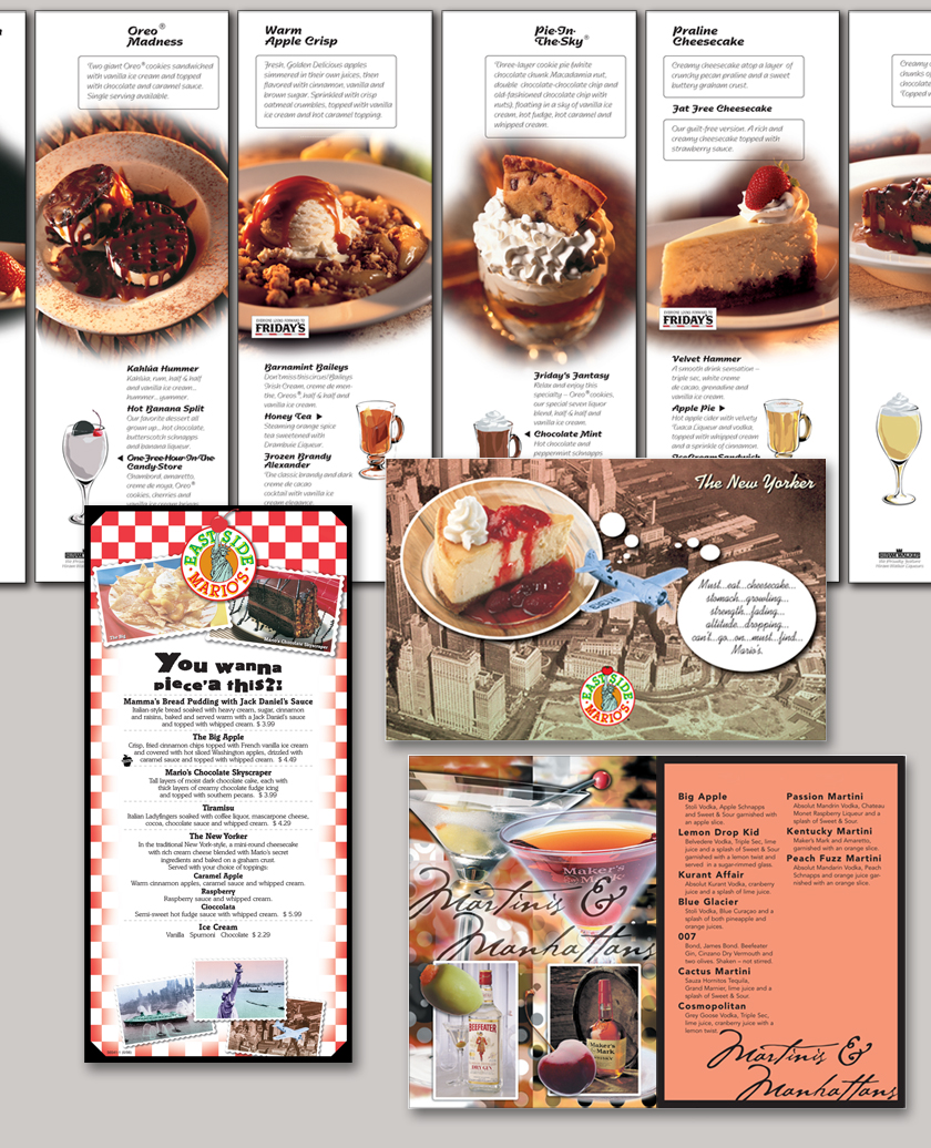
I found another menu today, this one is okay but I know it can use more improvements. The pictures directly in the center are a little too much. I feel if the pictures were smaller and off to the side of the menu it wouldn't be as distracting on the menu. It is all about food, but you want to have a design that works well with the flow of the menu. The pictures don't go too well with the text boxes because it creates too much movement and tension within the reading of the menu. You want to create a menu that is good to read. The pictures are good but don't make the menu better because it weighs the piece down too much.
Monday, April 21, 2014
Bad Menu
http://www.badpandagraphics.co.uk/images/portfolio/menus/l/WOTM-MENU.jpg

I found a menu design that I once again found problems with to help me improve my design this week, this one is really bad. First, the type is horrible and there is very little variation, I can't tell if two different fonts were even used. Second, the text is group so closely together it becomes hard to even read and understand. You want to have a menu that is clear to read, period otherwise it just creates more confusion. Some of the items have a description and some don't, I know that this is bad thing to have on the menu if the layout isn't the same throughout the piece. You can have it both ways sometimes into a design but its got to have clarity into the design. Otherwise, if you don't pay attention to what the type is doing you have this mess. This menu is just plain bad typography all around its weighing it down severely.
I found a menu design that I once again found problems with to help me improve my design this week, this one is really bad. First, the type is horrible and there is very little variation, I can't tell if two different fonts were even used. Second, the text is group so closely together it becomes hard to even read and understand. You want to have a menu that is clear to read, period otherwise it just creates more confusion. Some of the items have a description and some don't, I know that this is bad thing to have on the menu if the layout isn't the same throughout the piece. You can have it both ways sometimes into a design but its got to have clarity into the design. Otherwise, if you don't pay attention to what the type is doing you have this mess. This menu is just plain bad typography all around its weighing it down severely.
Menus
http://www.menutemplates.org/menu-templates/ice-cream-menu.html

So we learned today that project 4 is making a menu all out of type. I already have seen some menus today during my research in class, but I figured I find a good example tonight to focus on. I feel that menu's look easy to make but have discovered its all about the typography. And if your spacing is whack and out of place it can ruin the whole form of the menu. I found this ice cream menu template to critique. The color scheme and graphics work well together, however I feel the font on the menu is too childish. The fonts clash too much and don't work well together. When designing something its great to have font variation but the different fonts need to work well together. The type is legible but it needs work for sure if it wants to be a better menu. Any restaurant could easily find another designer to make them a better menu, as a designer you need to know what looks best and apply it to your design.
So we learned today that project 4 is making a menu all out of type. I already have seen some menus today during my research in class, but I figured I find a good example tonight to focus on. I feel that menu's look easy to make but have discovered its all about the typography. And if your spacing is whack and out of place it can ruin the whole form of the menu. I found this ice cream menu template to critique. The color scheme and graphics work well together, however I feel the font on the menu is too childish. The fonts clash too much and don't work well together. When designing something its great to have font variation but the different fonts need to work well together. The type is legible but it needs work for sure if it wants to be a better menu. Any restaurant could easily find another designer to make them a better menu, as a designer you need to know what looks best and apply it to your design.
Saturday, April 12, 2014
Fonts

http://www.fonts.com/font/the-foundry/foundry-sans
I decided to look up more good fonts choices that I could use for future project. I found this sans font that I think would have worked well for my bottle label project. Its not too serious or not simple that its weak for a font choice. I feel this font would be good for many project that require some text.
Good Uses Of Typography
http://naldzgraphics.net/freebies/40-best-fonts-for-better-typography-designs/
I decided to look up some good uses in typography to get more strong ideas for project four. The only thing I know for project four that it will be multiple pages in length. I looked up good fonts for future use. Project 3 I felt this time was successful and I finally had the right type on my water bottle label. I know there are things I need to check but I can fix them.

Friday, April 4, 2014
Water Bottles
http://www.bottleyourbrand.com/water-bottle-labels
http://www.bottleyourbrand.com/custom-beer-label
 I found another website that will help me in the future if I needed to make water bottle labels. I know what needs to go on them and I have made sure that I have all the type and information I needed on the bottle for Wednesday. I have looked up custom bottle labels some more and saw more ideas that could help me improve my design even more. I decided to just look up labels in general because there are more possibilities besides just water bottle design.
There are beer labels, wine labels, soda bottles labels, and even food label out there to use for more brainstorming ideas. The thing about label design out there is there are more ideas out there than I thought of.
http://www.bottleyourbrand.com/custom-beer-label
I found another website that will help me in the future if I needed to make water bottle labels. I know what needs to go on them and I have made sure that I have all the type and information I needed on the bottle for Wednesday. I have looked up custom bottle labels some more and saw more ideas that could help me improve my design even more. I decided to just look up labels in general because there are more possibilities besides just water bottle design.There are beer labels, wine labels, soda bottles labels, and even food label out there to use for more brainstorming ideas. The thing about label design out there is there are more ideas out there than I thought of.
Monday, March 31, 2014
Spacing on The Label
http://waterbottlelabelsguide.com/finding-the-right-size-of-water-bottle-labels/

Today in class, we talked about the spacing and how important where text is placed on our labels. I know that when I test print I want to have my label's text in the right levels of hierarchy. I decided to look up more examples of do's and don'ts for my label design. I know the colors have to be the right colors otherwise they will clash, right now I have shades of blues. I know putting white text on a yellow background is a obvious no in any design, because that is a no brainer. One tip I found helpful is the website's tips on finding the right water bottle label size. This website was able to answer a lot questions I had when I started thumbnails for this project 3. I also got great tips on designing water bottle labels for a company in general. Your want to have the right amount of branding for your company whenever you are designing something for the company.
Things I know I have to watch out for ....
1. Spacing is crucial
2. The Fonts
3. color scheme
4. sizing
5. clarity
Today in class, we talked about the spacing and how important where text is placed on our labels. I know that when I test print I want to have my label's text in the right levels of hierarchy. I decided to look up more examples of do's and don'ts for my label design. I know the colors have to be the right colors otherwise they will clash, right now I have shades of blues. I know putting white text on a yellow background is a obvious no in any design, because that is a no brainer. One tip I found helpful is the website's tips on finding the right water bottle label size. This website was able to answer a lot questions I had when I started thumbnails for this project 3. I also got great tips on designing water bottle labels for a company in general. Your want to have the right amount of branding for your company whenever you are designing something for the company.
Things I know I have to watch out for ....
1. Spacing is crucial
2. The Fonts
3. color scheme
4. sizing
5. clarity
Sunday, March 30, 2014
Uniquely Shaped

http://creativeaboutdesign.wordpress.com/2010/08/03/clever-space-saving-water-bottle-lh2o/

I found these strangely shaped water bottles amusing to look at. Its geometric but clever and I like it because its one of those things I would buy because I am in love with the design. The Label design on this is pretty simple but I like the H20 concept and how they used the molecular formula to build their design shape. Science was involved into the idea. The size and shape of these are interesting because I have seen little water bottles before but this concept takes it to another scale. The name of this bottle is called LH20 and was designed by a company called Agua De Luso. The design is meant to be easy to hold and store.
Saturday, March 29, 2014
Water Bottle Info
http://www.blushprintables.com/waterbottles-detailed.html

So far I noticed there are other things that go on a water bottle besides just the name brand and the logo. The bottle has also nutrition facts as well on the label and the recycling symbol. I have looked Poland spring, deer park, and even store brand labels to get more ideas. Take these custom made labels for example they have the nutrition facts on them in different ways to help me brainstorm more ideas. The more examples I find before I finish project 3 the better. I want to have a firm grasp on this project especially in what I need to make my design successful. I know having all the parts and the correct sizing for my design will be important to have a well design.
Thursday, March 27, 2014
Water Bottle Styles
http://www.bottleyourbrand.com/
http://youtu.be/RJK1AEs9ZFM

Water bottle sizes and shapes vary by the company and their brand. Some companies I have looked up have even bigger bottle dimensions so their actual label sizes are bigger and are different than basic water bottle labels at 8x2 in. I found this great website to help me get more ideas on my brand of Natural Spring Water. I found some benefits of Vinyl water bottle labels if I was actually making labels for a company. I found a water bottle label I found that was cute for an upcoming wedding, its a nice design for a water bottle label.
http://youtu.be/RJK1AEs9ZFM
Water bottle sizes and shapes vary by the company and their brand. Some companies I have looked up have even bigger bottle dimensions so their actual label sizes are bigger and are different than basic water bottle labels at 8x2 in. I found this great website to help me get more ideas on my brand of Natural Spring Water. I found some benefits of Vinyl water bottle labels if I was actually making labels for a company. I found a water bottle label I found that was cute for an upcoming wedding, its a nice design for a water bottle label.
Vinyl
| |
Monday, March 24, 2014
The Fiji Water Company
http://www.fijiwater.com/

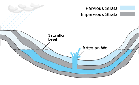
I looked up the water bottle company, Fiji Water to examine their design. Their philosophy is their water company is the finest water, artesian water from the earth. Their whole process in making the water is done by an artesian well method. I decided to lookup what this method is. The mean demographic of this company is mostly targeted at the rich I believe, because it seems like its fancy water. Most of the celebrities on the website support the company and this company actually offers door to door delivery of their product. They actually have several subscription plans for their door delivery for anyone to choose. The water bottle design overall, is very elegant with a illusion background of the water bottle. The font and typographical elements of the design stand well together, because it goes well with the overall theme of the company.

I looked up the water bottle company, Fiji Water to examine their design. Their philosophy is their water company is the finest water, artesian water from the earth. Their whole process in making the water is done by an artesian well method. I decided to lookup what this method is. The mean demographic of this company is mostly targeted at the rich I believe, because it seems like its fancy water. Most of the celebrities on the website support the company and this company actually offers door to door delivery of their product. They actually have several subscription plans for their door delivery for anyone to choose. The water bottle design overall, is very elegant with a illusion background of the water bottle. The font and typographical elements of the design stand well together, because it goes well with the overall theme of the company.
Sunday, March 23, 2014
Stuff On A Water Bottle Label

http://www.dasani.com/#drops
Today I looked up the Dasani Water Company and looked at their designed water bottle. This water is purified water with enhanced materials. One thing I know about their brand from researching their website, is their bottles are made from recycled plastic and are used to make other recycled products. I didn't know that 30% of the material is made from a plant resource to make this bottle 100% recyclable. I like that this bottle is design for the present use and future use. One thing I want to consider for my label design is what audience am I targeting? This feature on this bottle actually targets young and old with recycling and I think that's clever. The font of the word "Dasani" goes well with the overall design, when I think of water bottle design I'll remember the ideas from this company.

Subscribe to:
Posts (Atom)